At least seven in every ten visitors who arrive on your landing page will leave. Your visitors must comprehend what’s in it for them as soon as they arrive, in to keep that number low.
The relevance of your landing page and offer should be communicated in your title, which they will read first.
Pick a picture that represents your offer
It’s important to have an image that aligns with your target market. Because the purpose of your image is to evoke a feeling in the viewer, it should depict how your visitor would feel after accepting your offer.
Due to the possibility that certain photos will perform better than others, t is advisable that you carry out a split test of your choices.
Create a compelling copy
Spend the time to create the ideal headline and the ideal image, but don’t waste it by failing to use the right words to compel the reader to take the desired action.
Your copy should be crystal clear, and succinct, and should direct the visitor to the action you want them to take. To interest the reader, compelling copy also addresses the visitor directly by utilizing “you” and “your.” Below, we’ll cover copy tips in more detail.
The lead form should be placed above the fold
You don’t want your prospects to have to browse through your landing page to find your offer, therefore your lead form needs to be easily accessible should they decide to convert right away.
“Above the fold” simply implies that users won’t need to scroll to see the form; it will be visible as soon as they land on the page. A link to a form could be present here.
Include a call to action that is distinct and obvious
One of the numerous aspects of your landing page that drive conversion is the call-to-action (CTA), which is likely the most significant component.
Making use of a color that somewhat contrasts with the other elements present on the website would be ideal because the CTA button has to stand out.
Make it clear what you want website visitors to do by using an action verb that says it in plain English, such as, “download,” “submit” or “get it now.”
Offer something that is relevant
Consider your landing page to be a stop on the trip of your lead to your final offer, which would be your good or service. You share your lead’s personal information in exchange for your offer.
It must be pertinent to your company’s operations as well as enticing enough to convince your visitor to give their contact information.
Ask for only what you actually need
You want to learn as much as you can about your lead, but the amount of information you should ask for will vary depending on their level of familiarity with you, where they are in the buying process, and how much trust they have in you.
To lower the entry barrier, only request the information you absolutely need in your lead form. To nurture a new lead, a name and email are more than enough.
Discard the navigation
Your landing page’s sole and exclusive goal is to turn visitors into leads. Any links that compete with it, especially internal links to other pages on your website, will detract from it.
Delete all further links from your page that might distract your prospect from the main goal.
Create a responsive page
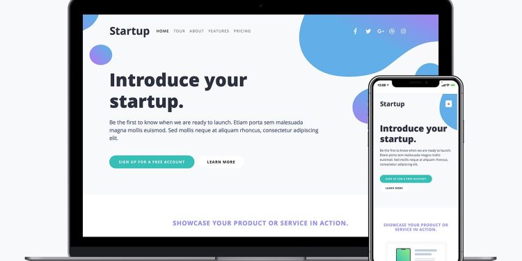
Your landing pages must be responsive, just like every other page on your website, to support all viewing situations. You certainly don’t want your form to disappear from mobile devices.
Give all of your visitors the chance to convert, regardless of how they access your page.
Search engine optimization
Although you’ll be directing visitors to your landing page through, social media posts, email campaigns and other marketing strategies, it’s equally crucial to optimize it with the correct keywords to improve paid and organic search. Every time someone looks up your keyword, your landing page should come up.
Don’t forget to include a ‘thank you’ page
After a lead fills out your form, you should send them to a thank you page. When your potential client takes the appropriate step, you may choose to display a ‘thank you’ message either on the same page or immediately after.
